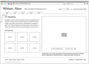
A website wireframe is a visual guide that shows a website’s framework. You may have also heard it called a page schematic or screen blueprint. By giving the website’s content layout, a wireframe gives the reader a skeletal framework of interface elements and navigational systems, as well as how these work together.
What the wireframe lacks in style, color, or graphics, it makes up for in functionality, behavior, and priority of content. The goal of a wireframe is to focus on what a screen does, rather than its appearance. There exists a great deal of variety in how a wireframe should be formed. They can be pencil drawings, whiteboard sketches, or a production from the broad array of software applications available.
In general, wireframes pinpoint:
- Types of information displayed
- Spectrum of available functions
- Priorities relating to information and functions
- Display rules
- Displays resulting from different scenarios
Wireframing allows designers to quickly make prototypes of pages, all the while determining the practicality of a design concept. Within the process of building a website, wireframing is where thinking becomes tangible. Wireframing typically begins between high-level structural work, such as flowcharts or site maps, and screen designs. They encourage the exchange of ideas and understandings between the many stakeholders and developers at the design table. Utilizing the wireframe allows developers to get a visual and tangible understanding of a site’s functionality. At the same time, designers sitting at the table are using web frames to visualize links between pages and the UI process. Business representatives can ensure their objectives are met. Wireframing bridges the information architecture to the visual design, giving everyone a common ground for conversation on website design and development.
As with any planning or initial stages of a project, overlaps in professional roles can engender conflict, making wireframing a controversial part of the design process.
Some drawbacks to the wireframe include:
- difficult for designers to assess how closely the wireframe shows actual screen layouts
- 2-D diagrams cannot effectively represent devices such as expanding panels, hover effects, and carousels


